Saturday, September 26, 2015

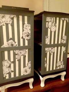
His and Hers Nightstands

I have had these night stands forever it feels like, before the twin pregnancy. I held onto them because they were just so different, but the problem is with holding onto furniture and storing it here and there and moving it from place to place, it starts to get pretty beat up. Beat up furniture is usually not a problem but this one had some water damage that made some areas bubble a little. I fixed most everything but one of the tops just wouldn't return to flat so it is what it is. Everyone tell me they can't see it. I reply with BUT I CAN!  The perfectionist in me just can't allow it but since they came out so well I still put them up for sale just not at what I normally would. 


First my plan was to do something simple lol, like a black top white base with a simple stencil down the front....haha quite the difference to what the final project turned out to be. 
I started out simple with all white and black top and it wasn't enough so I added the black base....well the line where the wood meets wood wasn't straight and very noticeable when it was black against white so I decided to make the frame grey and leave the inside white but I couldn't get a nice straight line with that either but that was mostly just impaicenece. So that's when I decided to do the lines. The measurement inside the square was 11.5" and the tap was 1" and so it was a pain in booty to get them straight and the same size. After spending about an hour trying that I had an epiphany.  I decided to use my silhouette cutter and make lines that way I could at least figure out where I wanted the middle line to go and line up the next. 

I taped and painted it again with white to fill any holes that might still be there with the tape then painted with grey. I didn't tape well enough apparently and next time I will use frog tape so I had some leaks.  So I had to touch those up and it still wasn't the perfection I was going for so I decided to cover up the imperfections with some paper images. I used flowers for the girls and stop watches for the boys. 


Pin It!

Wednesday, September 16, 2015

Antique dresser makeover - Greys and black

                Little antique dresser up cycled into beauty! 


Here's a cute little dresser I got off craigslist. It's definitely a real antique, heavy and all real wood. Here is the before picture.

I decided to go with a black and grey coloring because I really feel like the neutral colors sell the best, so if I am not doing a custom piece for someone I like to use neutrals and since I'm not a huge fan of beige I went with the black version of neutral.


I added little details in black between the drawers and on the side detailing. I used tape for some parts, but most of the time it's easier just to do it with a small ain't brush and maybe just use the tape as a crutch. When it was done and time to put the drawers in of course they didn't fit. I don't know when I will ever learn...always belt sand the bottom of the drawer and really sand the top and sides. This helps prevent the drawer from sticking after you have painted on layer after layer.
Pin It!

Friday, September 4, 2015

Image Transfer on old French dresser

This dresser was in some serious bad shape and with the amount of layers of paint on it I was not about to sand it all off, so instead I sanded what I could and decided that I would do an image transfer on the front to disguise all the imperfections on the front.  For the sides we used a skim coat, which you are supposed to use on walls when you are plastering to give it a nice smooth surface.  It worked wonders.....And it was so easy to sand off the plaster coating.
The before 

The after 


So I painted with a cream color paint and then I researched and researched and researched how to transfer an image onto furniture.  There were so many different ways and the way I wanted to do it was with paint thinner and you rub the image onto the surface, then go over with a sharpie or paint...kinda like tracing.  But every place I saw said to use a laser print and that it will only work with a laser print......well I don't know what I was doing wrong, but I went to kinkos which only does laser prints and the transfer method never worked.  It did however work when I used a print from my old printer, which I can't find the cord for so that was worthless.

Here's the image I used:

SO I found the mod podge method, which is time consuming and comes out looking very antique looking.  I liked the look it is just a lot of work.  You take an enlarged inverse of a print and glue it face down.  Then after it has had at least 6-8 hours to dry you get it wet and rub away the paper.  Sometimes more than you want comes off, but since I am going with an antique look it's not too bad. I am just working on perfecting where the papers meet since instead of paying kinks $60 for enlarged print I went to BlockPosters.com and it prints it out on several sheets for you.


A bit of advice double and triple check that you are putting the paper on the right way and in the right spot, because it is a pain in the butt to get the paper off if you do it wrong....which I DID.
Pin It!

Free china cabinet made into a beautiful sofa/entry table

So I got this for free and I am always down with free stuff. Even if I end up not doing anything with it I can just give it away or throw it away if it is in really bad shape. In the case of this one the top was definitely in bad shape. It needed new shelves new glass since pieces were missing and a whole new bottom piece of wood. So instead of spending a bunch of money on that I just worked with the bottom. Here is a before picture.

And here is the after.


This is where I learned that you can print black and white images 42" wide and as long as you want. I was just going to glue the image on so I went to the front and asked them to print the image I had made from a vintage image of New York.  The girl said ok it's ready for you at the back and it was only $4.30!  The last large image I printed there was just over $175 so I was shocked. But I guess when it's black and white and no wider than 42" it uses a different machine and paper which is awesome.


My father in law had been saying why all the Paris stuff and my reply was that so much goes with Paris, for example the fluer de lies and the scrolls. But New York is pretty amazing too and since I wanted this to be pretty simple with just the image and painting I went with the New York skyline and black white and grey for the painting. I'm really into the black white and grey right now for some reason but it's great because if I am doing images they are SOOO much cheaper and it's fun to play with the vintage images you can find.
Pin It!

Jewelry armoire makeover

Here's a custom makeover to a plain ole standing jewelry armoire. It was a custom order for a client that wanted it white, black and grey tones with some Paris and chandeliers.
**TIP: before you start anything that has felt drawers or lining make sure you tape them up and cover them with paper. They are hard to clean so you don't want sanding dust or paint to get on it. Also bag and label all the screws, handles and hinges in separate bags so you know which screws go where.


I first painted it black and used some wax in certain places before painting it white. From there I did some distressing and to give it a more cohesive feel I took some black stain to it to give it all those shades of grey.

I used the reverse transfer method for the images.....the thing I learned later which would have been great to know before is that kinkos can print out black and white on regular paper any size 42" and as long as you want?! I thought I had to just work with the 11x17" prints that I could print from the copiers there. So on the sides I used to sheets which is annoying because you are always left with some sort of a line where the two pages meet up.

For the inside part that you see when you open the door I made a vintage looking image with a fluer de lies that I found on Pinterest and messed with in Photoshop. For the outside I used a couple different images, some illegible script a chandelier and some crowns. All of it I got off Pinterest most of the images are from graphics fairy which gives you free good sized printable images. I also used a foggy background to match the other image.


I did the same with the front image just switched out the crown and chandelier with the Effiel tower and a large "Paris".

From there is was just about spraying the handles and clear coating.
Pin It!

Wednesday, July 29, 2015

80's laminate dresser makeover

my friend has had this dresser her whole life and she wanted to redo it. The picture she showed me of the style she wanted was a super distressed real wood dresser. When she showed me a picture of the dresser she wanted redone I asked her I could just buy her a new one that was real wood lol. But she was attached to hers so I did what I could. I am bummed, because I forgot to take a before picture and it was such a crazy transformation.

What I did to make it look like real distressed wood was to first paint it a wood color. Since when you took off the 80's gold handles and a couple of screws the drawers fronts came off I decided to use spray paint for the base. Once I had it painted dark brown I waxed it in areas where I wanted the second coat of paint to be removed.


The front has a transfer of a vintage bluish green paper and over the top I stenciled. We picked out new handles and there you go.
Pin It!

Full on surprise bedroom makeover

My friend has been wanting a new bedroom since college she said...the problem is that her husband is indesicive when it comes to furniture and paint. So I said let just go all out and redo the room a day when he is away. So that's what we did. Here's the before.

Once we picked out a few pieces of furniture and the coloring for the furniture, I sent her paint samples and links to bed spreads. Also I had her pick up some frames to go on two of the walls plus the Nightstands. 


So we chose Black and Tan for the furniture and went with NYPD blue for the walls. I also drew some custom lamp shades and sprayed the base of the lamp in black. Here's a before and after of the lamps. 


Once the wall was painted and the furniture was in there I took off to home goods where I got some chrome and black decor to finish the room off. That had to be my favorite part. Here's before and after of the wall with the TV. The desk was there basically just to hold the cable boxes and balance the room out. 


Pin It!